
Dashboard Widgets
6 min read · Intermediate · Reporting
A dashboard is a page of widgets: KPI cards, charts, tables, and a few activity and calendar panels that give your team a live read on the business without anyone having to run a report by hand. Most widgets pull from a saved report, so once you've built a report that shows the right rows, putting it on a dashboard is mostly picking a widget type and pointing it at that report. This guide walks through adding a widget, touring the standard types, wiring one up to a report, arranging the layout, and what to do when none of the built-ins quite fit.
Open a dashboard
Head to Dashboards in the main navigation. Open an existing dashboard from the list, or click Create Dashboard to start a new one and give it a name. Every dashboard starts empty until you add widgets to it.
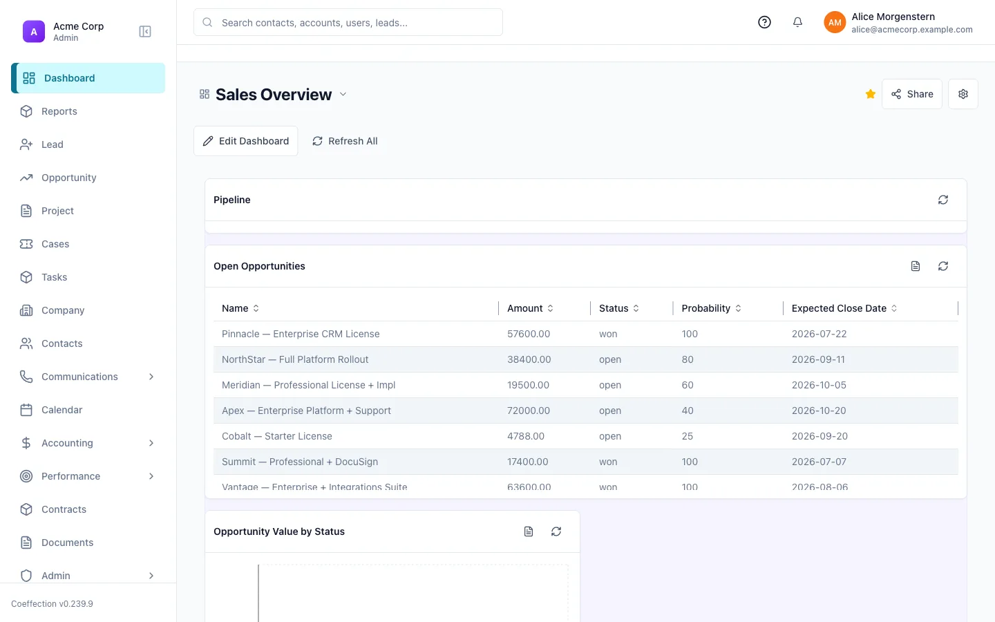
Turn on editing and add a widget
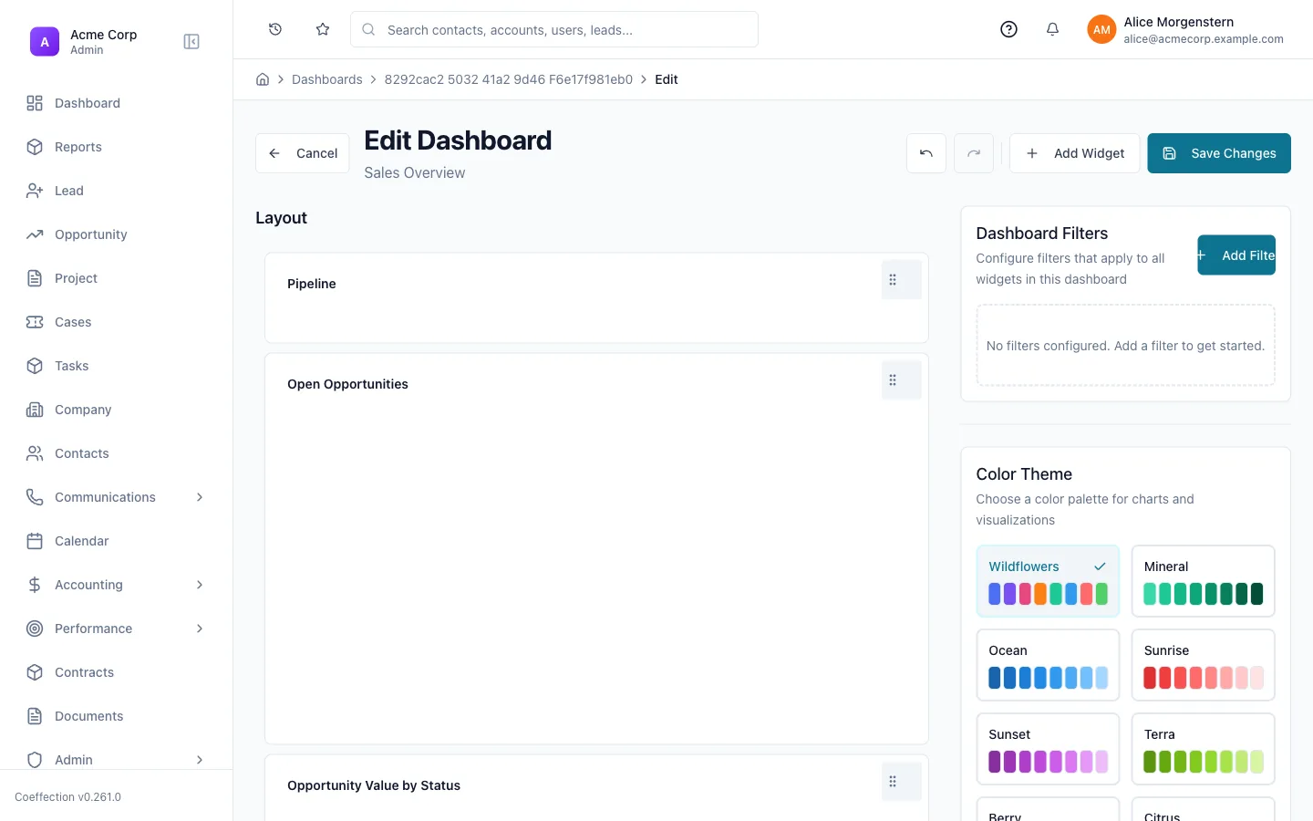
On the dashboard, click Edit Dashboard to switch into edit mode, then click Add Widget. A picker opens with two tabs: Built-in, the full catalog of standard widget types described below, and Custom Widgets, any tenant-specific widgets your workspace has saved for reuse (more on those in the last step). Pick a type to add it to the dashboard.
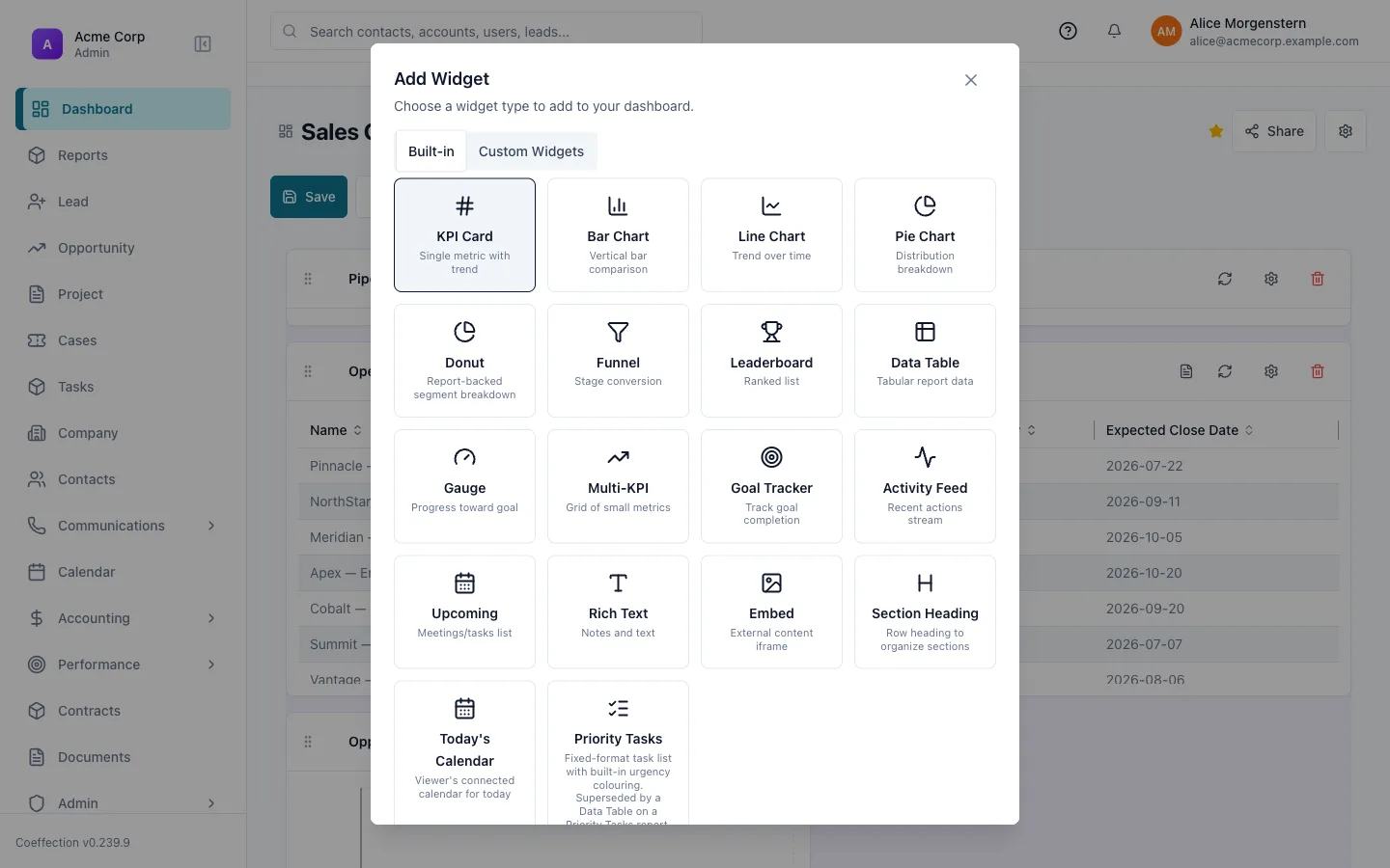
Tour the standard widget types
The Built-in tab covers a lot of ground. A few of the ones you'll reach for most:
- KPI Card: a single number with a trend, good for things like open opportunities or pipeline value.
- Bar / Line / Pie / Donut: the standard chart shapes for comparisons, trends over time, and breakdowns.
- Data Table: a tabular view of a report, with the columns you choose.
- Funnel, Leaderboard, Gauge, Multi-KPI, Goal Tracker: purpose-built visuals for stage conversion, rankings, progress toward a target, and small grids of related metrics.
- Activity Feed, Upcoming, Today's Calendar: live panels of recent activity and what's on the schedule, with no report to configure.
- Rich Text, Embed, Section Heading: non-data widgets for notes, external content, and organizing a busy dashboard into labeled sections.
Most widgets need a data source; some don't
Widgets built around a report (KPI Card, the charts, Data Table, Funnel, Leaderboard, and a few others) ask you to pick a report when you configure them. Activity Feed, Upcoming, Today's Calendar, and the non-data widgets (Rich Text, Embed, Section Heading) skip that step entirely and just drop onto the dashboard.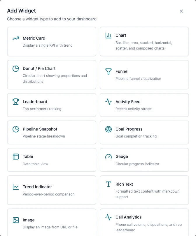
Configure it: bind a report and choose columns
For a report-backed widget, the configuration dialog walks through a short sequence: give it a Title, then pick a Data Source: search your saved reports and select the one whose rows you want. Next comes field mapping, which adapts to the widget. A Data Table calls this step Choose Columns and lets you pick which of the report's columns to show, while a chart asks for an axis field and a value field, and a KPI Card asks which field to treat as the metric. A Preview step shows the widget rendered with real data before you commit, and a final step lets you set an optional cache duration and save.
Fix it in the report, not the widget
If the numbers or rows look wrong, the fastest fix is usually back in the report itself: its filters, grouping, and sort are what the widget inherits. A widget that's pointed at the right report rarely needs much adjustment beyond which columns to show.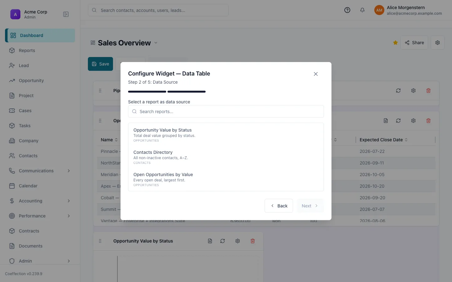
Arrange and resize the layout
Still in edit mode, drag any widget by its header to reposition it on the grid, and drag its bottom-right corner to resize it. Other widgets flow around the one you're moving. When the layout looks right, click Save, or Cancel to discard the changes and leave the dashboard as it was.
Request a widget the standard types don't cover
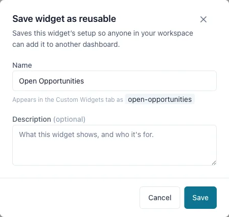
If a report-backed widget gets you most of the way there, an admin can turn your exact configuration into something the whole workspace can reuse. Configure the widget the way you want it (report, columns, filters), then use Save as reusable to save it into your workspace's Custom Widgets catalog. From then on it shows up under the Custom Widgets tab in the Add Widget picker for anyone on your dashboards. If what you need really can't be expressed as a report (a bespoke layout, or a data view none of the standard types support), ask a workspace admin, or reach out to Coeffection support to scope something built around exactly what your team needs.
Once your dashboard reflects the metrics your team actually watches, the next step is making sure the people behind those numbers can reach each other without leaving the CRM. That's covered in the next guide, Client Communication: Email, SMS & Meetings.
Next up
Client Communication: Email, SMS & MeetingsReach customers over email, text, and video without leaving the CRM.